-
CSS3 Transforms
almost 8 years ago
Transform means to change the complete appearance of an element, mainly to improve it's visual.
CSS3 came up with the new properties to change shape, size and position of an element. These all new changes are made possible by single transform property.
The transform property is having different properties for two-dimensional and three-dimensional changes.
With the help of CSS3 transform property we can rotate, skew, scale and translate an element in both plane as well as in the 3D space.
1. Translate() Method:-
The Translate() Method is used to move the position of an element. In 2D the translate() method moves an element in x-axis and y-axis.
Here is the format of Translate() Method:-
div {
-ms-transform: translate(30px, 50px); /* IE 9 */
-webkit-transform: translate(30px, 50px); /* Safari */
transform: translate(30px, 50px);
}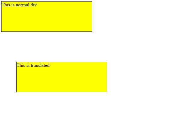
The above example is used to move the position of a div to 30px right and 50px down from its current position. To move left and up we will use negative value.
2. Rotate() Method:-
The rotate() method is used to rotate an element in clockwise or anti-clockwise.
This is the format of rotate() method:-
div {
-ms-transform: rotate(50deg); /* IE 9 */
-webkit-transform: rotate(50deg); /* Safari */
transform: rotate(50deg);
}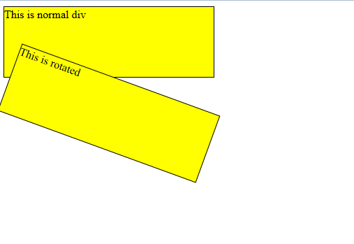
The above example is used to rotate a div 50 degree in clockwise direction. For anti-clockwise direction we will use a negative value.
3. The Scale() Method:-
The scale() method is used to increase or decrease the size of an element. The parameters passed are passed for width and height.
Here is the format of scale() method:-
div {
-ms-transform: scale(2, 3); /* IE 9 */
-webkit-transform: scale(2, 3); /* Safari */
transform: scale(2, 3);
}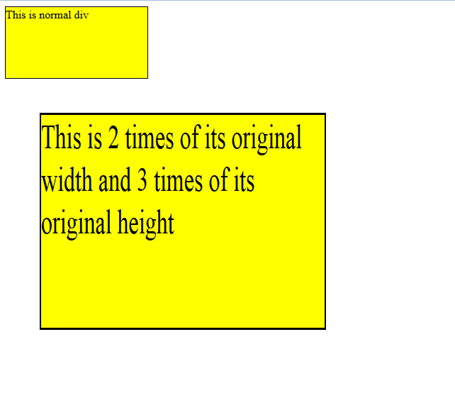
In the above example the scale() method will increase the width of an element twice and increase height thrice. To decrease the height and width of an element we will use negative value.
4. The Skew() method:-
The skew() method is used to bend an element in x or y axis in given angle.
skewX() method is used to skew in x axis while skewY() is used to skew in y axis.
Below is the format of skew() method:-
div {
-ms-transform: skewX(30deg); /* IE 9 */
-webkit-transform: skewX(30deg); /* Safari */
transform: skewX(30deg);
}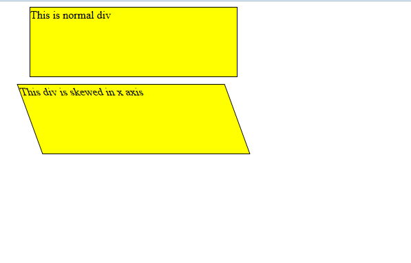
Above example is used to skew an element in x axis.
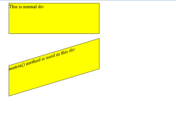
5. The Matrix() Method:-
The matrix() method merge all the 2D transforms to give a single output.
It takes 6 parameters containing rotate, scale, translate and skew elements.
.This is the format of passing the parameters: matrix(scaleX(),skewY(),skewX(),scaleY(),translateX(),translateY()):
Below is the format of matrix() method:-
div {
-ms-transform: matrix(1, -0.3, 0, 1, 0, 0); /* IE 9 */
-webkit-transform: matrix(1, -0.3, 0, 1, 0, 0); /* Safari */
transform: matrix(1, -0.3, 0, 1, 0, 0);
}


0 Comment(s)