-
Circle checkbox style in WPF
over 7 years ago
Creating style for circle checkbox:
<Style TargetType="CheckBox" x:Key="CircleCheckbox">
            <Setter Property="Cursor" Value="Hand"></Setter>
            <Setter Property="Content" Value=""></Setter>
            <Setter Property="Template">
                <Setter.Value>
                    <ControlTemplate TargetType="{x:Type CheckBox}">
                        <Grid>
                            <Grid.RowDefinitions>
                                <RowDefinition Height="24"></RowDefinition>
                            </Grid.RowDefinitions>
                            <Grid.ColumnDefinitions>
                                <ColumnDefinition Width="24"></ColumnDefinition>
                                <ColumnDefinition ></ColumnDefinition>
                            </Grid.ColumnDefinitions>
                            <Border Background="White" BorderBrush="#C6C6C6" BorderThickness="1" CornerRadius="0" Width="20" Height="20" VerticalAlignment="Center"  >
                                <Grid>
                                    <Ellipse x:Name="outerEllipse" Grid.Column="0" Fill="Blue" Margin="2">
                                    </Ellipse>
                                </Grid>
                            </Border>
                            <ContentPresenter Grid.Column="1" x:Name="content" Margin="5,0,0,0" HorizontalAlignment="Left" VerticalAlignment="Center"/>


                        </Grid>
                        <ControlTemplate.Triggers>
                            <Trigger Property="IsChecked" Value="True">
                                <Setter TargetName="outerEllipse" Property="Fill" Value="Red">
                                </Setter>
                            </Trigger>
                            <Trigger Property="IsChecked" Value="False">
                                <Setter TargetName="outerEllipse" Property="Fill" Value="Blue">
                                </Setter>
                            </Trigger>
                        </ControlTemplate.Triggers>
                    </ControlTemplate>
                </Setter.Value>
            </Setter>
     </Style>
Adding style to checkboxes:
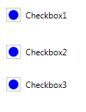
   <CheckBox  Grid.Row="1" Content="Checkbox1" Style="{StaticResource CircleCheckbox}" Margin="1,2,14,-2">
        </CheckBox>
        <CheckBox  Grid.Row="1"  Content="Checkbox2"  Style="{StaticResource CircleCheckbox}" Margin="0,54,0,-54">
        </CheckBox>
        <CheckBox Grid.Row="1" Content="Checkbox3" Style="{StaticResource CircleCheckbox}" Margin="1,100,-1,-100">
        </CheckBox>
OUTPUT:
Default CheckBox
On Click of CheckBox
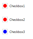
Blue color is for unchecked checkbox and red color is for checked checkbox. You can also remove circle in case of unchecked checkbox by simply changing the color as:
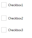
<Trigger Property="IsChecked" Value="False">
      <Setter TargetName="outerEllipse" Property="Fill" Value="White">
      </Setter>
</Trigger>
and then the output is:
Hope, this code will help you. Thanks


0 Comment(s)