-
How to create simple Chatbox Speech Bubble
over 7 years ago
Hey all!
This blog post is about creating simple chatbox speech bubbles. There are 4 separate classes. One for the chatbox conversation, second for the speech bubble, third and fourth for the two persons interacting respectively. The speech bubble has been given specified height and width. The speech bubble will be positioned accordingly giving the transformation and rotation degree. The conversation bubble will too be set to seem like the messages from two different persons.
Find the sample code snippet below.
HTML :
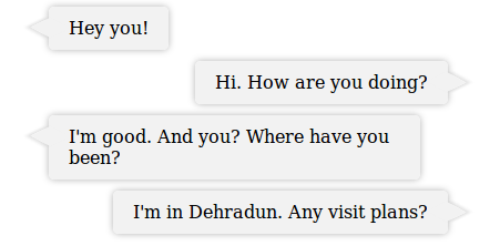
<div class="chatbox" type="textarea" >
    <p class="bubble me">Hey you!</p>
    <p class="bubble you">Hi. How are you doing?</p>
    <p class="bubble me">I'm good. And you? Where have you been?</p>
    <p class="bubble you">I'm in Dehradun. Any visit plans?</p>
</div>
CSS :
.chatbox {
    width: 400px;
    margin: 0 auto;
}

.bubble{
    background-color: #F2F2F2;
    border-radius: 5px;
    box-shadow: 0 0 6px #B2B2B2;
    display: block;
    padding: 10px 18px;
    position: relative;
    vertical-align: top;
}

.bubble::before {
    background-color: #F2F2F2;
    content: "";
    display: block;
    height: 16px;
    position: absolute;
    top: 11px;
    transform:         rotate( 29deg ) skew( -35deg );
    -moz-transform:    rotate( 29deg ) skew( -35deg );
    -ms-transform:     rotate( 29deg ) skew( -35deg );
    -o-transform:      rotate( 29deg ) skew( -35deg );
    -webkit-transform: rotate( 29deg ) skew( -35deg );
    width:  20px;
}

.me {
    float: left;
    margin: 5px 45px 5px 20px;
}

.me::before {
    box-shadow: -2px 2px 2px 0 rgba( 178, 178, 178, .4 );
    left: -9px;
}

.you {
    float: right;
    margin: 5px 20px 5px 45px;
}

.you::before {
    box-shadow: 2px -2px 2px 0 rgba( 178, 178, 178, .4 );
    right: -9px;
}
OUTPUT :
That easy it is. :)


0 Comment(s)