This blog is part of 1 Tute Sets.
Bootstrap Tutorial
Tute set by mukul.kant
8 Blogs-
Chapter 2: Bootstrap Grid System
almost 10 years ago
Basically, grid is a format which is divided into div columns. This is a very useful method to manage HTML layout and users can make easily.
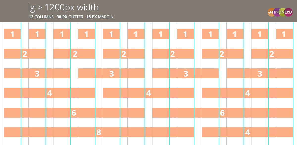
In bootstrap it is based on 12 columns, you can group the columns together to create wider columns.
According to official documentation of Bootstrap−According to above statement, the Bootstrap 3 is mobile first, it means that the Bootstrap code first preference is to targeting smaller screens like mobile devices, tablets, and then “expands” components and grids for larger screens such as laptops, desktops.
How to work with Bootstrap Grid System -Bootstrap Grid System work with 2 main part rows and columns. Row named class should be placed in the .container class, by this it will render with proper padding. All content should be placed within the column.
Grid system has four classes:
- xs (for phones)
- sm (for tablets)
- md (for desktops)
- lg (for larger desktops)
Because the width is defined in percent on this class which makes more dynamic and flexible layouts.
Media Queries -Media queries is an important part, for both responsive and mobile-first layout. Here bootstrap allows you to move, show, hide content on viewport size with default CSS class.
Below is an example and details for column classes with viewport size -
/* Extra small (xs), (used for phones or less than 768px) */
/* No media query since this is the default in Bootstrap */

/* Small (sm), (for tablets or 768px and up) */
@media (min-width: @screen-sm-min) { ... }

/* Medium (md), (for desktops or 992px and up) */
@media (min-width: @screen-md-min) { ... }

/* Large (lg), (for large desktops or 1200px and up) */
@media (min-width: @screen-lg-min) { ... }
This all is a default and standard format by bootstrap If you want to change you can customize it.
For example, if you want 3 column of same width div then you have to write your code like below -<div class = "container"> <div class = "row"> <div class = "col-xs-4"></div> <div class = "col-xs-4"></div> <div class = "col-xs-4"></div> </div> </div>
and this basic structure for Bootstrap grid -<div class= "container"> <div class= "row"> <div class= "col-*-*"></div> <div class= "col-*-*"></div> </div> <div class= "row">...</div> </div>


 "Click to preview")
0 Comment(s)