Hi Readers!
Progress bar, as the name says, is used to show a user's progress. The progress can be anything. For example, how far the user has completed a process,
Bootstrap provides many different types of progress bars. Commonly used are the vertical types. They are easy to code and understand.
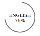
In this blog post, you will learn to code circular progress bars. I have provided here a static progress bar. With the use of Javascript, animated progress bars can be made that work when the page is loaded. For now, let us learn about the static ones.
The code is provided below :
HTML :
<div class="radial-01 radial-three-quarters">
    <span class="radial-01-number">ENGLISH 75<span class="radial-01-syb">%</span></span>
    <span class="radial-01-border-r"></span>
    <span class="radial-01-border-l"></span>
</div>
CSS :
.radial-01 {
      position: relative;
      width: 100px;
      height: 60px;
      text-align: center;
      padding-top: 40px;
      border-radius: 100%;
      margin: 20px;
}

.radial-01 .radial-01-number {
      position: absolute;
      top: 0px;
      left: 0px;
      right: 0px;
      bottom: 0px;
      background-color: #fff;
      border-radius: 100%;
      z-index: 20;
      font-size: 15px;
      padding-top: 35px;
}

.radial-01 .radial-01-number .radial-01-syb {
      font-size: 15px;
}

.radial-01 .radial-01-border-r:before {
      content: " ";
      display: block;
      position: absolute;
      top: -3px;
      left: -3px;
      right: -3px;
      bottom: -3px;
      background-color: #fff;
      border-radius: 100%;
      z-index: 5;
}

.radial-01 .radial-01-border-r:after {
      content: " ";
      display: block;
      position: absolute;
      top: -3px;
      left: -3px;
      right: -3px;
      bottom: -3px;
      background-color: #767676;
      border-radius: 100%;
      z-index: 10;
      clip: rect(0px,120px,120px,60px);
}

.radial-01 .radial-01-border-l:before {
      content: " ";
      display: block;
      position: absolute;
      top: -3px;
      left: -3px;
      right: -3px;
      bottom: -3px;
      background-color: #fff;
      border-radius: 100%;
      z-index: 5;
}

.radial-three-quarters .radial-01-border-l:after {
      content: " ";
      display: block;
      position: absolute;
      top: -3px;
      left: -3px;
      right: -3px;
      bottom: -3px;
      background-color: #767676;
      border-radius: 100%;
      z-index: 10;
      clip: rect(60px,120px,120px,0px);
}
OUTPUT :

Here, we have made a circle with class name .radial-01 with specified dimensions. Then, with the classes .radial-01-border-r and .radial-01-border-l and the CSS pseudo elements, we provide borders on the left and the right side of the circle.
Keep Coding!
0 Comment(s)