What is typography?
Typography is the visual representation of the written word, It's an art to make type visually legible through arranging the letters and making it visually appealing.
Typography is the most commonly used terms when it comes to discussion on designing. It's everywhere we look. It's on the website we visit, on the newspaper and books we read, even in your daily life (on the hoarding, billboard, advertisement on the busses and metro train, your daily usage products and even you can find in public washrooms.
Example: "N E G A T I V E S P A C E" is the most famous terms being used in designers community and one of the most effective parts of any design ( Here you can see few letters are missing like e,a,i,e,s,a,e. but you can easily read the word "N E G A T I V E S P A C E " which express the negative space always looks better).
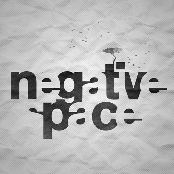
Image Source: https://www.designcrawl.com/awesome-typography-examples-5/
Fonts
Some common types of fonts you need to know about them.
Serif font
A typeface with a small line attached at the end of stroke is called a serif typeface.
Example of a serif font
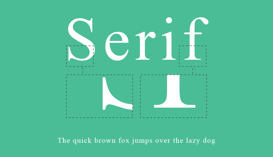
Commonly used in newspapers and print publication for quick reading. As you can see all the serif fonts have a tail at the end of each letter which makes the link between two letters, therefore the newspaper articles are easy to read as compare to others.
Serif fonts also being used most when it comes to classic and luxury.
Serif Fonts in a Magazine and Newspaper
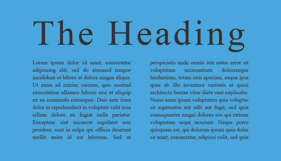
Top Serif fonts
Georgia, Century, Garamond, Times, Courier, Lucida, Trajan, Didot, Droid Serif Pro, Palatino, Baskerville, Bembo, Caslon, Bodoni, Bookman Old Style, Sabon, Mrs Eaves, Arno Pro, Clarendon, Rockwell.
Sans Serif Font
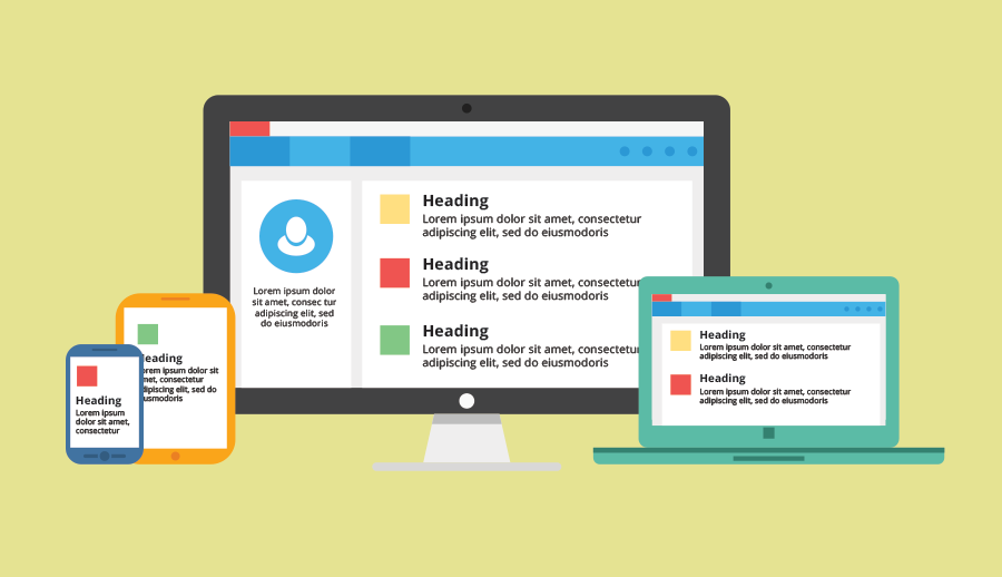
Considered to be the most modern, clean and stylish fonts without projecting line at the end. Also known for easily readable on computer, tablets, and smartphone.
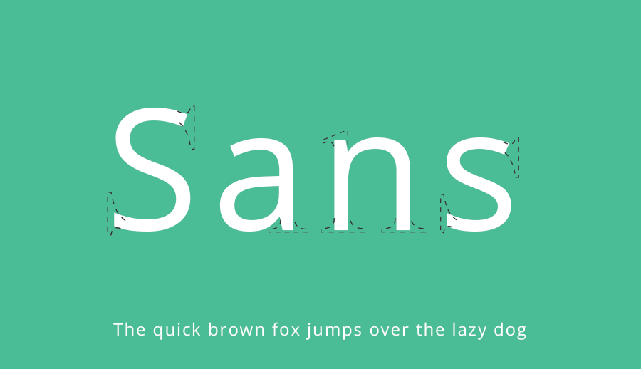
Sans serif fonts on website and apps
Display fonts
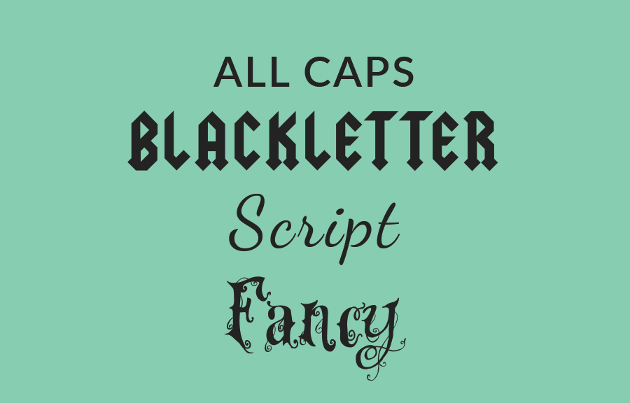
Display fonts look more decorative and fancy therefore they have been used in heading and titles. Display fonts come in different styles, like All caps, Script, Blackletter etc.
Selection of font
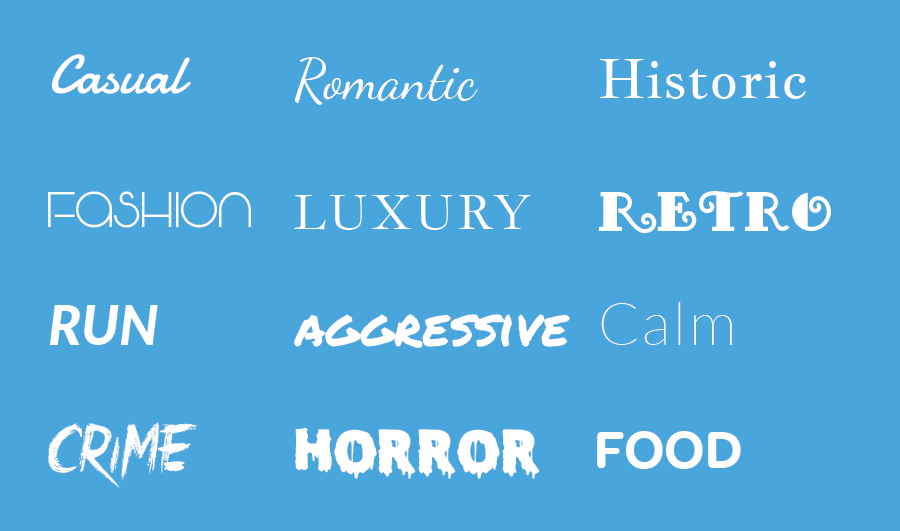
Choosing a right kind font is a difficult task, sometimes we choose the wrong font which may confused viewer. So it's better to understand what to select. Like we do carry ourself in a different type of parties and functions.
Outdated and overused
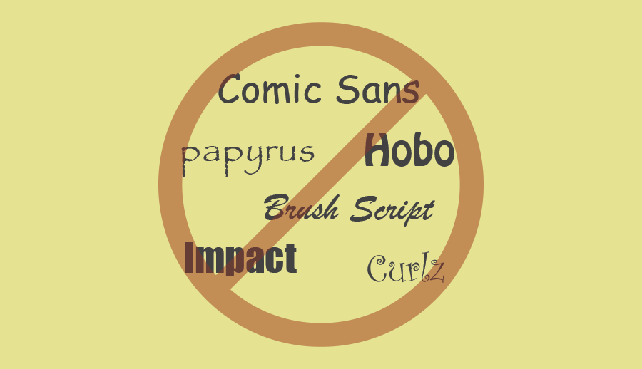
Comic Sans, Curlz, and Papyrus perfectly fit in this category. Nothing wrong with these fonts they were just overused and outdated. Try to avoid using them.
Combining fonts
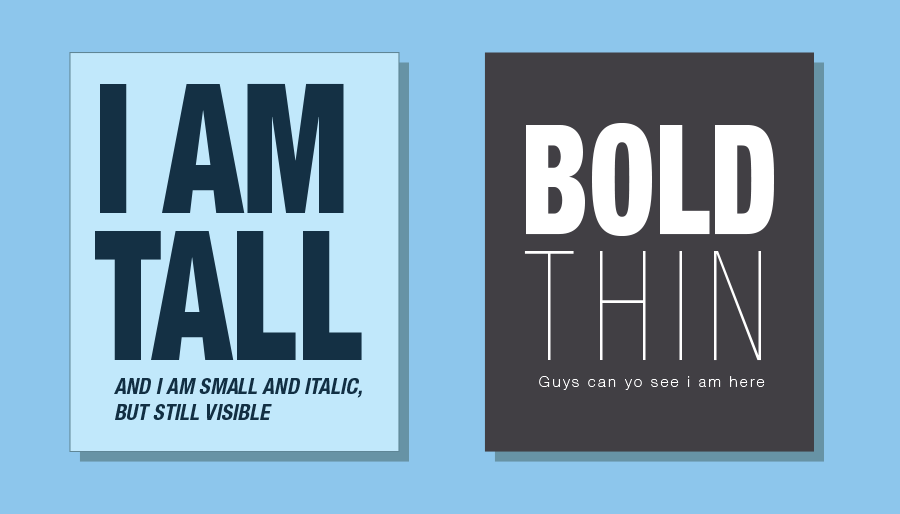
Like we do follow the contrast in our outfits, we should also follow the same with fonts as well. Two different types of fonts always complement each other like opposite sex.
Example: Short with tall, bold with thin, Reqular with italic, All caps with lowercap etc.
Few more important terms
Most important terms which matter the most - kerning, leading, tracking, and hierarchy. These small terms can make your design look more professional.
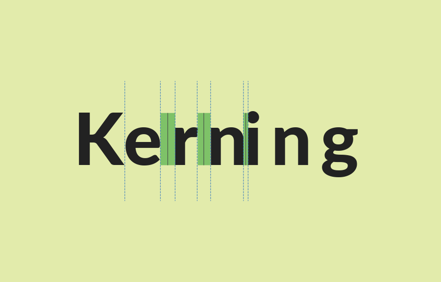
Kerning
Kerning is the space between specific characters.
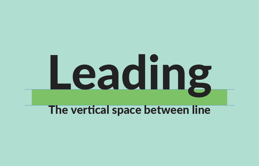
Leading
Leading is the space between lines of text, also known as line spacing.
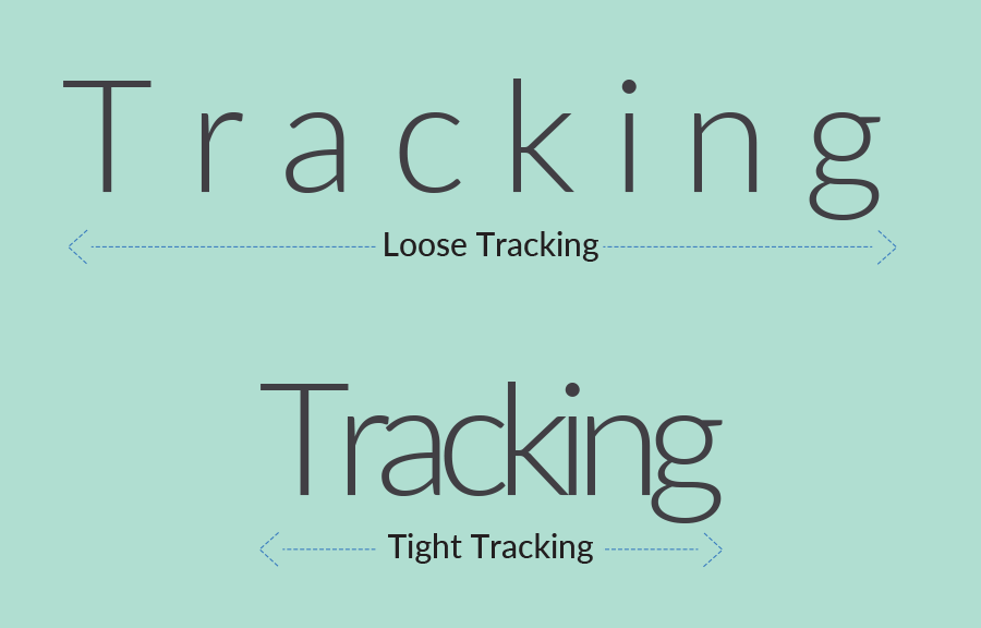
Tracking
Tracking is the space between groups of letters rather than individual letters like in kerning. One of the most important factor to make text readable and appealing. The best example for trekking is the highway signboard, you can easily read the text from a distance.
Hierarchy
Always set Hierarchy in your design to make sure the reader should read the most important point first then move on as per the set hierarchy.
0 Comment(s)