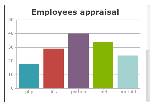
Today in this blog, we will learn how to implement chart on our web page using CanvasJs plugin. This CanvasJs plugin supports many different types of charts like line, column, bar, stacked, pie, doughnut ... etc. Some of the built-in features that are supported by the CanvasJs charts are zooming, panning, UI Integration, etc. Lets start with our code implementation.
Step 1: Very first step is to add the following link to your web page.
<script type="text/javascript" src="http://canvasjs.com/assets/script/canvasjs.min.js"></script>
Step 2: In your html file just add a div with id “wrapperChart”
<div id="wrapperChart" style="height: 300px; width: 100%;">
Step3: Add the following js code to your file.
  window.onload = function () {
    var chart = new CanvasJS.Chart("wrapperChart", {

      title:{
        text: "Employees appraisal"
      },
      data: [//array of dataSeries
        { //dataSeries object
         type: "column", /*** Change type "column" to "bar", "area", "line" or "pie"***/
         dataPoints: [
         { label: "php", y: 18 },
         { label: "ios", y: 29 },
         { label: "python", y: 40 },
         { label: ".net", y: 34 },
         { label: "android", y: 24 }
         ]
       }
       ]
     });

    chart.render();
  }
Output will be alike:

Now, what we done here is, first we have created an instance of a new Chart object. Next we have passed all the necessary chart “options” as a second parameter to the constructor. Finally to render the chart we have used the render() method.
Important chart “options” :
1. title: is like a label to the chart which describes what chart is about.
2. dataPoints: is an array of data that is to be rendered.
3. dataSeries: it is a parent of dataPoints, defines chart type and other options.
4. data: is another array element which collects one or more dataSeries objects.
You can also customize your according to your requirements like:
1. You can add prefix and suffix to the axis values.
axisX:{
     suffix: "yr"  /** Set axisX properties **/
}
2. In case of multi series column chart, you want to show the Legend indicating both columns. This can be achieved by setting showInLegend property in dataSeries to true.
3. You can also change the theme of the chart. CanvasJs supports some built-in themes like “theme1”, “theme2”, “theme3” to change the look of the chart. Set the theme property of the chart option.
And many more.
Happy Coding.
0 Comment(s)