Hi Friends,
I think most of you have heard of Angular Material UI and those who have seen it, they do like the clean and minimalistic idea and very simple layout which actually looks stunning. But that is for web. Now what if we want it for our WPF applications?
Probable answer is, we will be going for Telerik or DevExpress which may not provide the exact similar look but close to that with a hefty price tag. Then what, we can use Syncfusion controls community edition which is free but all of these customized controls have one major issue apart from their price tag (yes, the free ones also) and that is their customized code and most of the code requires a deep understanding of how they work (That doesn’t means they are bad, but they may look like an overkill if we want to work only on UI).
So we know that WPF introduces XAML to us which we use for creating UI and defining bindings (most powerful feature in WPF) and much more. As you have guessed until now, we need to modify our XAML to define new themes according to Angular Material fonts (Roboto I guess) but that will be a daunting task if you are in a hurry.
Thankfully an open source solution is there for you on Github (formerly on Codeplex but it is having its own website too) which actively being maintained and even if the support is no longer there in future (it is maintained by a single person so that might be a possibility, but it’s good so far), it is mature enough to keep you going.
Eager for a glimpse, obviously. So follow the link for the first look:
Angular Material Controls For WPF
Create a WPF project and Visual Studio(I am using VS2015) and open the package manager console from Tools>Nuget Package Manager>Package Manager Console.
When the console is ready type following command and press enter:
Install-Package MaterialDesignThemes
Now when the package is installed successfully, open the App. xaml file and copy the following resource dictionary section in Application.Resources:
<ResourceDictionary>
            <ResourceDictionary.MergedDictionaries>

                <ResourceDictionary Source="pack://application:,,,/MaterialDesignThemes.Wpf;component/Themes/MaterialDesignTheme.Light.xaml" />
                <ResourceDictionary Source="pack://application:,,,/MaterialDesignThemes.Wpf;component/Themes/MaterialDesignTheme.Defaults.xaml" />
                <ResourceDictionary Source="pack://application:,,,/MaterialDesignColors;component/Themes/Recommended/Primary/MaterialDesignColor.DeepPurple.xaml" />
                <ResourceDictionary Source="pack://application:,,,/MaterialDesignColors;component/Themes/Recommended/Accent/MaterialDesignColor.Lime.xaml" />

            </ResourceDictionary.MergedDictionaries>
        </ResourceDictionary>
Now when you are done with that open the MainWindow.xaml( or any other) and add following attributes in its <window :x..> section. It defines the background and the font for the window:
TextElement.Foreground="{DynamicResource MaterialDesignBody}"
    Background="{DynamicResource MaterialDesignPaper}"
    FontFamily="pack://application:,,,/MaterialDesignThemes.Wpf;component/Resources/Roboto/#Roboto"
In case you have any confusions about where to copy, take a look at following screenshot:

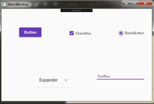
Now whenever you drag a control (say Button or Checkbox) you’ll see that it looks like an Angular Material control:

Yeah! That looks like a real deal. There are tons of customization options available and other controls like slider or Angular Material Toggle buttons are also available. You can change the color of the controls and if you consider yourself a ninja in XAML , you can customize the code and create your own Dll for your own customized UI because this thing is open source.
As I said before, I don’t need to treat that button as special button like in the case we do for other third party control libraries. It’s just a Material styled button which is exactly same to a default WPF button in functionality.
The whole code for your customization and demo purpose is given on following URL:
Code for Angular Material Library for WPF
Yeah, that “ButchersBoy(Mr.James Willock)” may sound somewhat dangerous to you and I can’t help you in it . Considering the name my suggestion is to grab the code and get the hell out of there asap.
Just kidding. It is an ultimate library for us developers and I’d say “great work” for Mr.James Willock (ButchersBoy) for providing this valuable resource as an open source project.
Above I have provided a demo and you can go to the website itself to see what you can do with this library. So exploring is the key to success, explore..build..enjoy..!
In next part we’ll take a look at how we can change our window to a Material look using another library as our window is still showing in default OS theme which doesn’t match with Angular Material theme.
Thank You.
Happy Coding.:-)
0 Comment(s)