Image Courtesy: http://www.limonadaestudio.com
Designing a website seems a daunting task for many, but as long as you are clear with the basics, you’ll find the process enjoyable and gratifying. It is more to it than a cool look & a flashy design. Young designer tend to forget that it’s the Usability and Utility that determines the success of a website and not the Wow Effect. I’m not going to focus on implementation details or the top design trends as it is already been discussed in a number of articles circulating around the internet; instead I’ll be focusing on the basic, common knowledge guidelines & principles that will help you create sophisticated design decisions with ease and efficiency. Without further ado, let’s browse through the basic 6 design rules that a web designer should never forget.
6. Simple is the new smart

An illustration of Simple Webdesign. Courtesy: http://www.trendleaks.com
Simple design is the top website design. It invites prospective clients to your website, allowing them to find what they are looking for and avail a service or make a purchase. On the contrary, cramming too much content creates confusion. If the visitors have to scan through the landing page to find what they are looking for, they get easily frustrated. To keep the page layout simple, always:
- Limit the page bandwidth: Replacing the heavy graphics with the smaller ones makes the website lighter. Besides, always choose a trusted web hosting provider to ensure optimized web performance.
- Adequate White space: Proper Spacing provides the adequate breathing room to the website. It can serve to split the compelling blocks of text and highlight the key areas for the visitor to see.
5. Intuitive Navigation

An illustration showing the Importance of Intuitive Navigation. Courtesy:https://image.slidesharecdn.com
Nothing is more frustrating than not been able to find what you are looking far. To ensure this doesn't happen to your website ensure that your pages are well-organized with a smooth top-down design. Visitors prefer a basic web design with an intuitive navigation on accepted design principles. According to Forrester Research, “50% of potential sales are lost because users can't find information and 40% of users never return to a site when their first visit is a negative experience.” Website’s navigation has an immense impact on the success or failure of the website. It affects SEO rankings, traffic, user-friendliness, and conversions. For a good navigation system, always:
- Place a simple search tool conspicuously for a cleaner visual experience for visitors
- Include easy to find links of main category and home page
- Follow three-click rule - It is observed that the shoppers want to find what they are looking for in three-clicks, else they leave the page. Keep the prominent icons like shopping cart, search toolbar, categories including product and services clearly labeled
4. Mobile-first concept

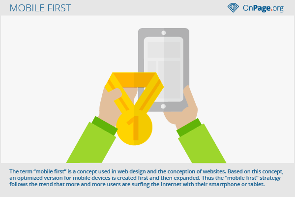
Illustration showing the importance of ‘Mobile first’ concept. Courtesy: https://en.onpage.org
As people are more likely to use a portable hand held device or a laptop, it is expected that a web-designer should realize the importance of offering content for the small screen devices first and then working up to the bigger screens. A crafty web-designer can get rid of the information or the content which is not 100% required while designing for small screen devices. However, he can allow the visually attractive extras as he switches to larger screens.
3. Responsive design

Image Courtesy: http://mashable.com
Please ensure that your website displays properly on major web browsers including Chrome, Safari, Firefox and Internet Explorer. Check your website on the aforesaid browsers to ensure that everything appears correct and in its desired place. Besides, it is also important that the site displays well on different screen sizes. An amazing way to implement a responsive site design are the CSS media queries.
2. Communicate through Visual Language

An illustration showing Visual Design Elements. Courtesy: https://image.slidesharecdn.com
As the old adage goes ‘Seeing is believing’. The best user interface and a modern website design must symbolize a balance of readability, legibility, typography, color, texture and multiple views. Too many images might slow the loading times of your website, but the visitors would like to see what they’re going to buy. Do most with least amount of cues and visibility. Choose a good digital camera to shoot the product images. A good editing software can help you save the clicked images in a low-resolution ‘thumbnail’ images for faster upload. Adding video tutorials to your website will keep the visitors engaged. It will have a dramatic impact on the customer engagement and sales.
1. Outrank the competition

Image Courtesy: https://www.linkedin.com
If you have a website with limited content and few pages, you are missing the opportunity to be found by the prospective clients. The higher your website ranks in the search engine, greater will be the number of clients you can attract. Always:
- Create quality content: Quality content is what Google wants to bring your website back in the search results. Create informative or educational content in the form of product reviews, articles, descriptions, blogs, etc.
- Keywords: Try getting as many long-tail and high ranking keywords in your content. Not only this, your team’s ability to choose specific keywords pertaining to your business, products listings or business description will set the tone for your success in outranking the competition.
How do you like the article? Is there something you’d like to add. Read more from the writer at FindNerd.com


1 Comment(s)