-
An Easy Guide to Material Design Implementation for Android Developers
over 7 years ago
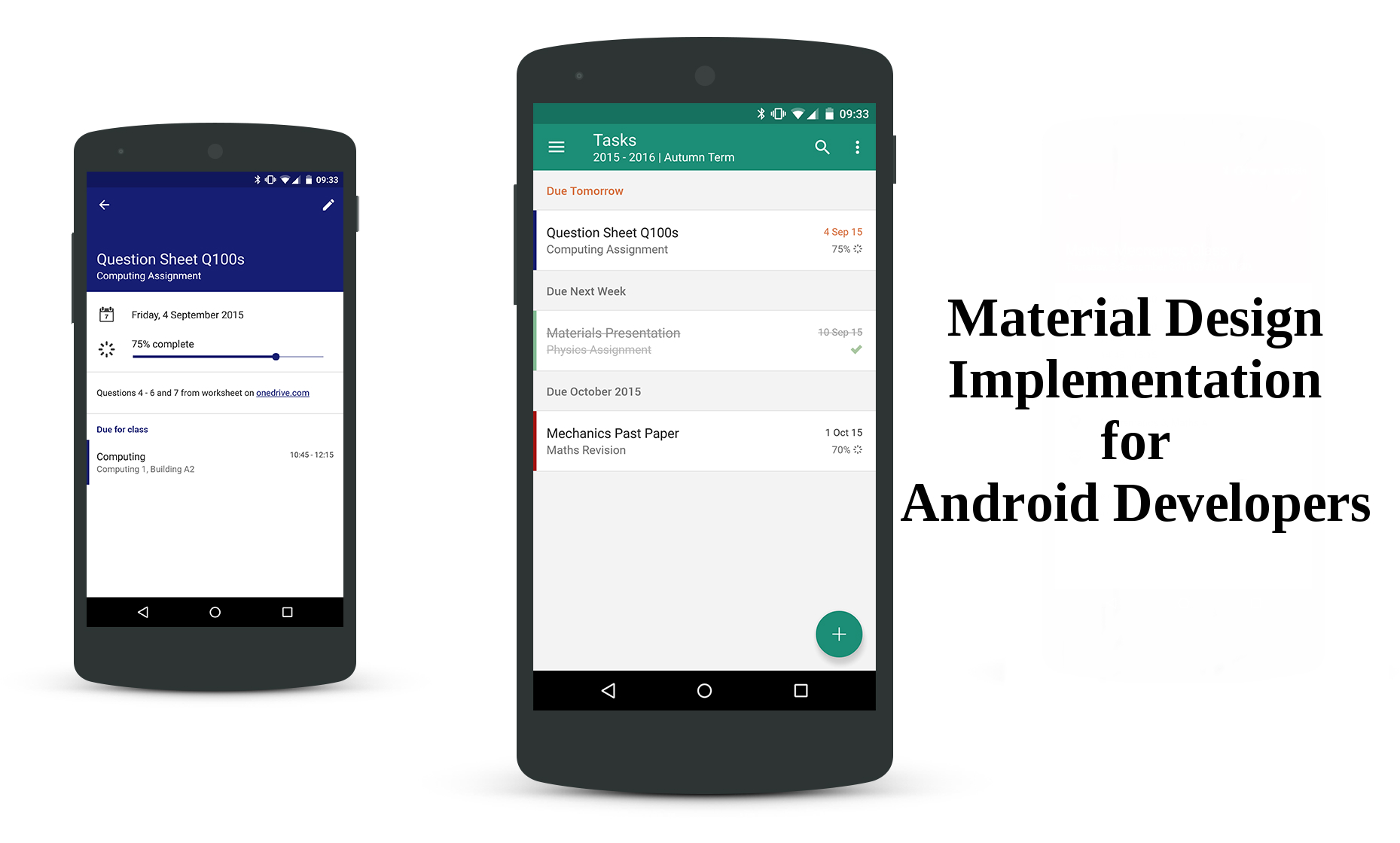
Material Design was launched in Google I/O 2014 for Android developers in 2014 with the purpose of revitalizing and improving the user interface, although it also works for iOS and web. However, it was something else. Material Design is a visual design language, a graphic guide from Google.
Material Design was part of a total modernization that modularized Android. All graphic resources now belong to a single Resource: Material Components. Now Material Components is the Android design support library, greatly facilitating the work of programmers.
This will be just a brief introduction for developers who want to start learning. You can start using Material Components by adding the com.android.support:design: library to your app/build.gradle file.
1) Important classes
a) CoordinatorLayout: helps to coordinate the behaviors of their children's views, adapting them to changes in other dependent views. Thanks to CoordinatorLayout, it is possible to make animations in displacement. But in turn, this class depends on the use of Behavior, our next class.
b) Behavior: Behavior allows interactions for the CoordinatorLayout child views. Do you want your FAB to contract and grow? Do you want your Toolbar move on the screen? All this is possible with Behavior.
2) Android Material UI Components:
a) Bottom Bar Navigation: Bottom Navigation Bars make it easier to explore and switch between Top Views with a single touch. To use Bottom Navigation, use the BottomNavigationView class. In addition, you can customize it by using State Selectors.
b) Bottom Sheet: the bottom sheets slide up from the bottom of the screen to reveal more content. To use them, simply add your Bottom Sheet directly in CoordinatorLayout.
c) Floating Action Buttom (FAB): a floating action button represents the main action in an application. Like any other widget, you should only include it in your XML design using the FloatingActionButton class. Keep in mind that you must choose wisely what your main action will be, and avoid blocking the screen.
d) Material Design Tabs: the tabs facilitate the exploration and change between different Views. The design support library introduced a new TabLayout class to style the Material Design tab. You only need to import the class <android.support.design.widget.TabLayout> into the AppBarLayout section of the CoordinatorLayout.
e) Navigation Drawer: the navigation drawer contains the navigation destinations for your app. Now adding a navigation drawer is very easy, since all the elements of your drawer are loaded from a menu resource and its header is a separate layout.xml.
f) Snackbar: it is a light component that gives feedback to users, and optionally provides an action. It can be implemented in any View.
g) Cards: just use the widget.CardView class. You can style it using Widget.CardContent, and remember to assign a background for the card to have a wave effect.
h) RecyclerView: we have the RecyclerView for lists and grids. With RecyclerView it is possible to design your data in many ways to manage lists and grids. Yo shoud use the RecyclerView class.
3) Animations
There are two important things when talking about animation in Material Design: surface reaction and shadow. For example, if you touch a screen, the point of contact is radiated. That is called "ink wave".
You can also see that there is a resting elevation of 2dp. When you touch it, it rises at your touch, indicating the user's interaction. No need to add buttons like "OK" and "Cancel" because you have your user interface elements that react subtly to your touch.
It is possible to use gray ink ripple with the attribute ?android:attr/selectableItemBackground. You can also control the color highlighting by using Android.colorControlHighlight, changing the gray by another color.
Conclusion
Personally, I recommend you, if you want to learn in depth how to use Material Design, use the Design Support library. It is the official tool of Google and has a lot of information about Material Design. What better library than the official support?
You can also read the Android development docs, they are good.
This article is a VERY brief introduction to Material Design, again, I recommend you read more and search for yourself.


 "Click to preview")
0 Comment(s)