Hi there!
To speak honestly, we as web developers, include lots of graphics, slideshows, CSS files etc. This makes our website media intensive. As a result, the website gets really bulky.
In such scenarios, where certain pages take some time to load, the user may get frustrated.
One option you may want to consider to reduce the frustration of users is to add a nice page loader.
A page loader is any sort of animation that visually signals the user that the page is loading and to wait for a few seconds. A page loader gives a good small distraction which can surely make the wait seem shorter.
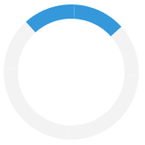
Below is an example of such a custom page loader.
HTML :
<div class="loader"></div>
CSS :
.loader {
  border: 16px solid #f3f3f3;
  border-radius: 50%;
  border-top: 16px solid #3498db;
  width: 120px;
  height: 120px;
  -webkit-animation: spin 2s linear infinite;
  animation: spin 2s linear infinite;
}

@-webkit-keyframes spin {
  0% { -webkit-transform: rotate(0deg); }
  100% { -webkit-transform: rotate(360deg); }
}

@keyframes spin {
  0% { transform: rotate(0deg); }
  100% { transform: rotate(360deg); }
}
OUTPUT :

Explanation :
The border size and the border color of the loader are specified using the border property. Now, to transform the loader into a circle, use the border-radius property.
There is a blue part that spins around inside the border. The spinning indicates the loading of the page. It is achieved with the border-top property. This can also be achieved by including border-bottom, border-left and/or border-right.
This helps to add more spinners.
The size of the loader is adjusted with the width and height properties.Lastly, an animation is added to the blue part to make it spin forever with a 2-second animation speed.
Note : It is advisable to include -webkit- and -ms- prefixes for browsers that do not support animation and transform properties.
Try for yourself to see a real result.
Keep Coding :)
0 Comment(s)