Hello Readers.
CSS gives us the freedom to draw many shapes and figures. But a triangle is one, that particularly amazes me. A triangle is made in 5 easy steps.
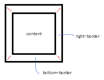
- Imagine a box with borders on all four sides with equal width. Notice how the borders meet at angles (shown by red line).

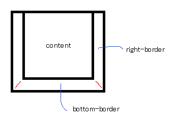
2. Remove the border from top.

3. Give the box 0 height and width.

4. Make the border transparent.
5. Finally, make the other two side borders transparent as well.

Simple. Ain't it? Here is a sample code.
HTML :
<div class="triangle"></div>
CSS :
.triangle{
  width: 0;
  height: 0;
  border-left: 50px solid transparent;
  border-right: 50px solid transparent;
  border-bottom: 100px solid red;
}
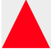
OUTPUT :

Happy Coding :)
0 Comment(s)