-
CSS3 Flexbox
almost 10 years ago
Hi there!
The
flexboxlayout mode has completely redefined layouts in CSS. It is not just a property but a whole new module.The CSS3 Flexible Box, or flexbox, arranges the elements on a page such that they would accommodate themselves according to varying screen sizes and varying display devices. The flexbox model provides an improvement over the block model in many aspects such as it has disabled floats, also the flex container's margins do not collapse with the margins of child contents. The only prime characteristic of the flex layout is the ability to adjust the dimensions of its children to fill the available space in the best way possible on different screen sizes.
The flexbox model is definitely easier to use. Child elements can be made to have flexible dimensions to adjust to the various display size. Also, positioning child elements have become much easier. Complex layouts can be achieved easily with a cleaner and simpler code.
The most important aspect of the flex layout is its ability to adjust the items' dimensions to fill the screen space on any device accordingly.
Flexbox layout is appropriate for the components that have to change orientation, resize, stretch, shrink, flips from vertical to horizontal, and so on.
To deploy this, set the display property as follows:
display: flexor
display: inline-flexAs we do so, the parent element will be defined as a flex container and its immediate children will be defined as flex items. The
flexvalue makes the parent element a block-level element whereas theinline-flexvalue makes the parent element an inline-level element.The following figure will explain the main idea behind the flex layout.
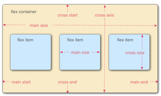
The flex layout constitutes of 2 parts :
1. Parent container (flex container)
2. Its immediate children (flex items)
The various browser support is given under :
- Chrome 29+
- Firefox 28+
- Internet Explorer 11+
- Opera 17+
- Safari 6.1+ (prefixed with
-webkit-)
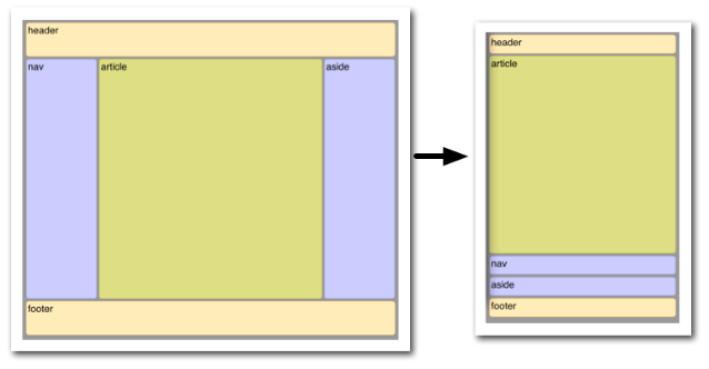
I am providing a very simple example showing how flexbox has the ability to automatically change the layout for different screen sizes. In this example, the elements change their sizes and also the order in which they appear. Flexbox makes this very simple.
HTML :
<header>header</header>
<div id='main'>
    <article>article</article>
    <nav>nav</nav>
    <aside>aside</aside>
</div>
<footer>footer</footer>
CSS :
body {
        font: 24px Helvetica;
        background: #999999;
    }

    #main {
        min-height: 800px;
        margin: 0px;
        padding: 0px;
        display: flex;
        flex-flow: row;
    }

    #main > article {
        margin: 4px;
        padding: 5px;
        border: 1px solid #cccc33;
        border-radius: 7pt;
        background: #dddd88;
        flex: 3 1 60%;
        order: 2;
    }

    #main > nav {
        margin: 4px;
        padding: 5px;
        border: 1px solid #8888bb;
        border-radius: 7pt;
        background: #ccccff;
        flex: 1 6 20%;
        order: 1;
    }

    #main > aside {
        margin: 4px;
        padding: 5px;
        border: 1px solid #8888bb;
        border-radius: 7pt;
        background: #ccccff;
        flex: 1 6 20%;
        order: 3;
    }

    header, footer {
        display: block;
        margin: 4px;
        padding: 5px;
        min-height: 100px;
        border: 1px solid #eebb55;
        border-radius: 7pt;
        background: #ffeebb;
    }

    /* Too narrow to support three columns */
    @media all and (max-width: 640px) {
        #main, #page {
            flex-direction: column;
        }

        #main > article, #main > nav, #main > aside {
        /* Return them to document order */
            order: 0;
        }

        #main > nav, #main > aside, header, footer {
            min-height: 50px;
            max-height: 50px;
        }
OUTPUT :
Happy Coding :)


 "Click to preview")
0 Comment(s)