-
Form validation using CSS
almost 10 years ago
Hello Readers
This blog will introduce you to how we can use input type and attribute in forms for form validation (checking the correctness of a value). Thus, a form validation refers to checking the correctness of the entered value. A form input will validate the value that is meant to be entered i.e. valid email ID, valid DOB, valid contact number etc. In this example of form validation, we’ll see a right tick for a correct value and a down thumb for an incorrect one. That is how we will come to know of the validation of the value we enter.
1. required attribute:
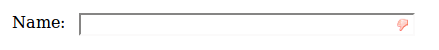
Required attribute specifies that an input field must be filled out before submitting the form, i.e. the particular input field should not be left empty. The simplest change you can make in your input field is as follows:
<form>
    <label>Name:</label>
    <input type="text" name="name" required>
</form>
Above code displays the following output. It can be seen that before entering anything into the box, a down thumb is shown.
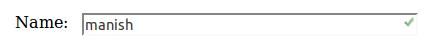
As soon as a single character has been entered this changes to a green marker to indicate that the input is 'valid'.
2. Text input type:
Input type gets interesting and more useful. Along with the text input type, there are now a host of other options, including email, url, number, tel, date and many others that are valid input types in HTML5.
Input type=”email”
Input type:"email" also requires the correct type of attribute i.e. an email (valid) and browser can be used to validate that email address.
<form>
    <label>Email Address:</label>
    <input type="email" name="email" required placeholder="Enter a valid email address">
</form>
placeholder which displays a instructions inside an input field. Above code displays the output shown under before you type anything into the box. A placeholder will appear as long as no value is entered in the field.

Different browsers implement this differently and accept different input. In sufficient to enter just *@-.-.
Here is how it appears in firefox:


INPUT type="url"
Input type:"url" accepts a properly-formatted URL which is the required type.
<form>
    <label>Website: </label>
    <input type="url" name="website" required pattern="https?://.+">
</form>
Above code display the following output:
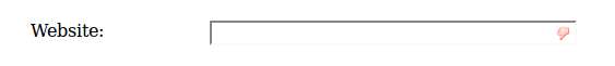
Url required pattern="https?://.+"> and input box will only accept text starting with http:// or https:// and at least one additional character. Like this :


INPUT type="number":
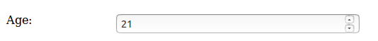
The number types input accept parameters for min, max. A number is the required input, typically displayed as a 'roller'
<form>
    <label>Age:</label>
    <input type="number" size="6" name="age" min="18" max="99" value="21">
<form>
Above code display the following output:
Input type="range"
The range types input also accept parameters for min, max. The range input displayed as a 'slider'. In this input type, a max and a min limit has been set and the entered value has to be preferrably in between the two.
<form>
    <label> Satisfaction:</label>
    <input type="range" size="2" name="satisfaction" min="1" max="5" value="3">
</form>
Above code display the following output:

Required valid/invalid input using CSS:
The first set of styles can be used to mark an input box as 'invalid', by using the required icon (down thumb in this case), and set the styles like coloring the box, border, etc. the given input do not require this and an invalid value uses the following:
input:required:invalid, input:focus:invalid {
  /* insert styles for invalid form input */
}
For the required and 'valid' input types, you can use the following:
input:required:valid {
  /* insert styles for valid form input */
}
sample styling using with image:
input:required:invalid, input:focus:invalid {
    background-image: url('../images/invalide.png');
    background-position: right top;
    background-repeat: no-repeat;
}
input:required:valid {
    background-image: url('../images/valid.png');
    background-position: right top;
    background-repeat: no-repeat;
}


 "Click to preview")
 "Click to preview")
 "Click to preview")
 "Click to preview")
 "Click to preview")
 "Click to preview")
 "Click to preview")
 "Click to preview")
 "Click to preview")
 "Click to preview")
 "Click to preview")
 "Click to preview")

0 Comment(s)