In the sea of unlimited changes to the digital landscape that we know as the internet, there seems to always be a new way to attract and inform potential customers to your website. And although newcomers to the industry of online marketing chase one trending strategy after another, experts understand that there are a few numbers of methods which actually work.
So, how do you wade through all the noise and find the right ways to inform and attract potential customers to your website. Here are 7 tested ways and web design tips you need to master and you will eventually build a selling machine website.
Excellent UI and UX
If people cannot find it, then they cannot buy it. It is advisable that you keep your website clean, crisp and rather easy to navigate. However, it is also important that you study usage and traffic patterns in order to adjust your site based on what visitors are looking for.
The ability to search a website is crucial. And you need to study search data in order to see if there are certain trends to make front and center.
Including Third-Party Validations
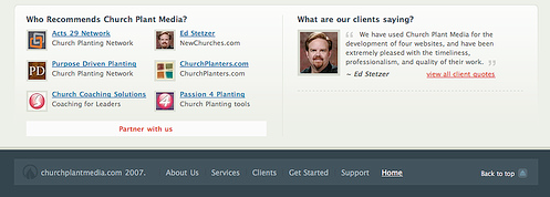
I’m talking about awards, case studies, silent lists, customer testimonials, and recognition that you have received, positive clipping and more. Potential clients would want to know what current customers have to say about their experiences and who you do business with.

Client lists are particularly important if your customers are businesses, and if you got some big-name clients, people would want to see that. Also, adding a presence on social networking sites is increasingly becoming a popular form of validation.
Such information with the appropriate links and great graphic design should be clearly incorporated in order to entice and inform potential customers to do business with you.
Free Offers
Successful online marketers have long used freebies and offer as the primary driver in client acquisition.
Freebies or free offers has created a space for entry into sales funnel, helping you to initiate a series of value jumps as well as following sales to the higher-ticket items as your client moves up the ladder of product or service offered by your company.
The better you tailor your free offer to your sales funnel, then the easier you can move people up in your ticket prices of items that they purchase from you.
Responsive Design
It is not good that you assume that your clients will only visit your website through a computer. With the number of people surfing the internet through their smartphones and tablets, it is safe to optimize your website for such platforms.

Making your site optimized to different devices and ensuring easier access, potential customers will be less prone to click on the back button immediately.
Get Rid of click Baits
You need to make sure that you are careful about choosing the ads you use for your site. No one actually likes those annoying ads and it needs to be an active initiative on your part so you do not have them on your site.
And the idea of getting spam emails will surely not be pleasing to anyone. This will encourage potential clients to choose a different website just to avoid those annoying pop-ups and clicking potential sources of spam emails.
Stay on Point
The first thing that an individual will notice when visiting your website is the top 1/3 part of you page. Thus, it is necessary that such area contains essential and the most basic info regarding your website. This should include what you website is all about and how your audience can use it to find something they want.
Smart layout can allow potential customers to find the best information and options that they are looking for mush easier. Avoid descriptions that are too long since everyone is looking for simple and fast way to find info without unnecessary long definitions and instructions.
Clear Call-To-Action

We all want buttons or signs in order to immediately act, be it “Click here for more info”, “Sign-up for newsletters” or “Buy now” buttons. However, most small business websites do not provide such buttons or do not present them clearly enough. If you got a captive audience, then call to actions are the best thing to grab them!
0 Comment(s)