-
Shapes of CSS
over 9 years ago
Hello Readers!
In this blog post, let us learn how to create simple shapes that can be made even simpler using CSS. I am providing the code for 5 shapes we might be using then and now. Note that, all of the figures below use only a single HTML element. Try them.
- SQUARE
#square {
   width: 100px;
   height: 100px;
   background-color: red;
}
2. TRIANGLE
.triangle {
    width: 0;
    height: 0;
    border-left: 50px solid transparent;
    border-right: 50px solid transparent;
    border-bottom: 100px solid red;
}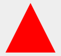
3. CIRCLE
.circle {
    width: 100px;
    height: 100px;
    background: red;
    -moz-border-radius: 50px;
    -webkit-border-radius: 50px;
    border-radius: 50%;
}
4. STAR
.star-five {
    margin: 50px 0;
    position: relative;
    display: block;
    color: red;
    width: 0px;
    height: 0px;
    border-right: 100px solid transparent;
    border-bottom: 70px solid red;
    border-left: 100px solid transparent;
    -moz-transform: rotate(35deg);
    -webkit-transform: rotate(35deg);
    -ms-transform: rotate(35deg);
    -o-transform: rotate(35deg);
}

.star-five:before {
    border-bottom: 80px solid red;
    border-left: 30px solid transparent;
    border-right: 30px solid transparent;
    position: absolute;
    height: 0;
    width: 0;
    top: -45px;
    left: -65px;
    display: block;
    content: '';
    -webkit-transform: rotate(-35deg);
    -moz-transform: rotate(-35deg);
    -ms-transform: rotate(-35deg);
    -o-transform: rotate(-35deg);
}

.star-five:after {
    position: absolute;
    display: block;
    color: red;
    top: 3px;
    left: -105px;
    width: 0px;
    height: 0px;
    border-right: 100px solid transparent;
    border-bottom: 70px solid red;
    border-left: 100px solid transparent;
    -webkit-transform: rotate(-70deg);
    -moz-transform: rotate(-70deg);
    -ms-transform: rotate(-70deg);
    -o-transform: rotate(-70deg);
    content: '';
}
5. HEART
.heart {
    position: relative;
    width: 100px;
    height: 90px;
}

.heart:before, .heart:after {
    position: absolute;
    content: "";
    left: 50px;
    top: 0;
    width: 50px;
    height: 80px;
    background: red;
    -moz-border-radius: 50px 50px 0 0;
    border-radius: 50px 50px 0 0;
    -webkit-transform: rotate(-45deg);
    -moz-transform: rotate(-45deg);
    -ms-transform: rotate(-45deg);
    -o-transform: rotate(-45deg);
    transform: rotate(-45deg);
    -webkit-transform-origin: 0 100%;
    -moz-transform-origin: 0 100%;
    -ms-transform-origin: 0 100%;
    -o-transform-origin: 0 100%;
    transform-origin: 0 100%;
}

.heart:after {
    left: 0;
    -webkit-transform: rotate(45deg);
    -moz-transform: rotate(45deg);
    -ms-transform: rotate(45deg);
    -o-transform: rotate(45deg);
    transform: rotate(45deg);
    -webkit-transform-origin: 100% 100%;
    -moz-transform-origin: 100% 100%;
    -ms-transform-origin: 100% 100%;
    -o-transform-origin: 100% 100%;
    transform-origin :100% 100%;
}
Keep Coding. :)


0 Comment(s)