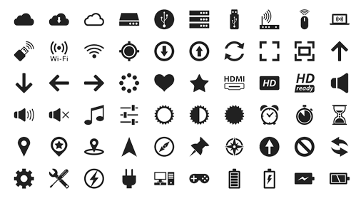
As a web designer i bought ink to this article to remind us all that
why we're using icons on the websites we create. Many of us has a perception that it has become an obvious case to include them in our projects as a matter ofcourse.

We see number of icons on daily basis.
They enhance the visual communication of our sites and can provide a better UI experience. Icons are most effective as they improve visual interest and grab the user's attention.
However now a days, we forget the reason behind using an icon, It becomes easy for icons to lose their effectiveness as we love to use them.
Below here are few basic points that we need to remind ourselves about the use of icons.
Bringing an aesthetic and universal communicating language into the design is its primary attribute. They make us aware of what the following is all about.
What makes them perfect for web & UI context is that they are very easily understand-able and quite easy to interpret.
They creates an interest in user. However a common mistake we make is that we use too many icons in a given setting.
Icons guide users while navigating page to page. Using too many icons will make them a mere decorative piece of element.
A lot of use for navigation on a single webpage can cause distraction quite often. A proper balance is necessarily required for quick understanding..
Icons add influential support when applied real time.The distinguished colors add wonderful support & understanding. Like a green checkmark shows something has been done correctly, a red cross icon shows there is an error!

Icons are everywhere around us. Without icons, we would be obliged to use text to explain certain functionality to our users, which could be monotonous sometimes.
Whilst this makes interfaces accessible and thus Icons provide us metaphors to communicate quickly.
0 Comment(s)