CSS Gradients:-
CSS3 gradients let you show smooth moves between two or more determined colors.
CSS3 defines two types of gradients:
- Linear Gradients (goes down/up/left/right/diagonally)
- Radial Gradients (defined by their center)
Linear Gradients :-
To make a linear gradient you should characterize atleast two shading stops. Shading stops are the colors you need to render smooth moves among. You can likewise set a beginning stage and a bearing (or an edge) alongside the angle effect.
Syntax :
background: linear-gradient(direction, color-stop1, color-stop2, ...);
- Linear Gradient - Top to Bottom :- This is the default gradient which shows a linear gradient that starts at the top.
Example :-
<!DOCTYPE html>
<html>
<head>
<style>
#grad1 {
    height: 200px;
    background: green; /* For browsers that do not support gradients */
    background: -webkit-linear-gradient(green, yellow); /* For Safari 5.1 to 6.0 */
    background: -o-linear-gradient(green, yellow); /* For Opera 11.1 to 12.0 */
    background: -moz-linear-gradient(green, yellow); /* For Firefox 3.6 to 15 */
    background: linear-gradient(green, yellow); /* Standard syntax (must be last) */
}
</style>
</head>
<body>

<h3>Linear Gradient - Top to Bottom</h3>
<p>This linear gradient starts at the top. It starts green, transitioning to yellow:</p>

<div id="grad1"></div>

</body>
</html>


Example :-
<!DOCTYPE html>
<html>
<head>
<style>
#grad1 {
    height: 200px;
    background: green; /* For browsers that do not support gradients */
    background: -webkit-linear-gradient(left, green , yellow); /* For Safari 5.1 to 6.0 */
    background: -o-linear-gradient(right, green, yellow); /* For Opera 11.1 to 12.0 */
    background: -moz-linear-gradient(right, green, yellow); /* For Firefox 3.6 to 15 */
    background: linear-gradient(to right, green , yellow); /* Standard syntax (must be last) */
}
</style>
</head>
<body>

<h3>Linear Gradient - Left to Right</h3>
<p>This linear gradient starts at the left. It starts green, transitioning to yellow:</p>

<div id="grad1"></div>

</body>
</html>

Radial Gradients :-
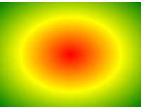
A radial gradient is defined by its center. To create a radial gradient you must also define at least two color stops.
Syntax :
background: radial-gradient(shape size at position, start-color, ..., last-color);
By default in radial gradients, shape is ellipse, size is farthest-corner, and position is center.
Example :-
<!DOCTYPE html>
<html>
<head>
<style>
#grad1 {
    height: 150px;
    width: 200px;
    background: red; /* For browsers that do not support gradients */
    background: -webkit-radial-gradient(red, yellow, green); /* Safari 5.1 to 6.0 */
    background: -o-radial-gradient(red, yellow, green); /* For Opera 11.6 to 12.0 */
    background: -moz-radial-gradient(red, yellow, green); /* For Firefox 3.6 to 15 */
    background: radial-gradient(red, yellow, green); /* Standard syntax (must be last) */
}
</style>
</head>
<body>

<h3>Radial Gradient - Evenly Spaced Color Stops</h3>
<div id="grad1"></div>

</body>
</html>

Note: Internet Explorer 9 and earlier versions do not support gradients.
0 Comment(s)