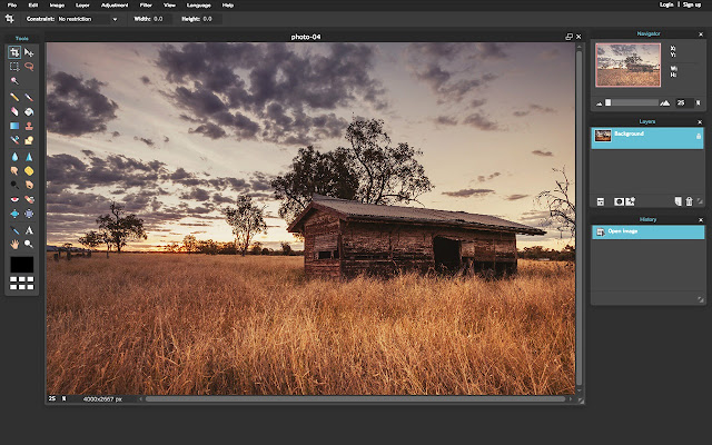
Images can look speaking provided that they have perfected. When you capture, the frame shows an awesome visual. But most of the times, its output fails your amazement. The blurriness, shadow and unnatural view of hues can end its charisma.
With Photoshop, you can re-create that magnetism. You can swap imperfections with perfections. What all you need is to edit those images as a professional. Just import those images in a folder for re-touching.
Here are a few tips that avail a number of options to undo the wrong shot, colours or dullness in your images.

1. Photo Composition: The WOW exclamation can come out spontaneously if you have a right composition of photos.
Solutions:
· Crop: It is one of the best image editing techniques that enables you to fade a busy & cluttered background for focusing on the main subject. Cut all inessential parts that are disturbing the frame of that photo.
· Straighten: With the help of Straighten tool, align the subject in that image correctly. If it is a landscape photo, follow the rule of thirds that allows you to place your best shots at the intersection points.
· Simplify: Avoid cluttering the frame with many objects. Rather, capture just two objects. Shift the focus to secondary objects sometimes, stealing the limelight.
2. Over or Under Exposed Images: An over and under ado looks weird in a snapshot. With the help of the histogram and light adjustment in the Photoshop, you can spill the magic.
Solutions:
· Curves: An epic feature called histogram can challenge the exaggerated or under exposure with the curve tool. Its upper right graph shows highlights that do not go right with the image and the lower-left curves represent shadows.
· Exposures: Upon finding the over or under-shadowed parts, adjust the light accordingly by using the exposure tool.
3. Dull and Grainy Image: The blurred edges can eclipse the image. If it gets a combination of dull colours, its impact can be distractive.
Solutions:
· Sharpen: To sharpen the edges, just move to sharpening panel. Browse options and improve its visibility to introduce clarity.
· Vibrancy: Since its colours look dull, you just increase its vibrancy by using the Vibrance slider.
· Brightness: Brighten it up with Brightness/Contrast icon in the Adjustment panel. Select “Layer”, then “New Adjustment Layer” and thereafter, the “Brightness/Contrast” in the New Layer dialog box.
4. A Bit Off Image: Sometimes, the click misses perfection. Simply say, it looks a bit off due to inappropriate colour selection, unsaturation and low intensity of different colours.
Solutions:
· Saturation: It defines an eye-catching adjustment of hues (colours), richness or intensity of that colour and brightness. Choose “image”, follow it up with “adjustment” and then, “hue/saturation” to directly adjust to the image layer, discarding the image information. If you want to saturate all colours in one go, select “Master”.
· Balancing Colours: To make it an apple of every one’s eyes, select the whitest or greyest or darkest colour in the image. Then, select other colours that will compliment that major proportion. Then comes the intensity of those colours. Adjust the intensity of the RGB colours while using the Color Balance tool.
· Contrast Adjustment: Different tones either seize one’s attention or distract completely. So, emphasize on the contrast of different tones in the image while playing around with the Saturation Adjustment tool.
5. Strong Shadows and Highlights: A shadow can unwantedly seek attention due to dark vision. Adjust it to create visibility of the objects that look hidden under a dark shadow.
Solution:
· Shadow/ Highlight Tool: Plug to Shadows/Highlights tool to fade the darkness, creating visibility and clarity in the snapshot.
Image Resizing:
These are a few common mistakes that often disturb the magnetism of the images. Upon making all such adjustments, work on resizing and compression. They are a few strong SEO factors that could interrupt the smooth browsing of the visitor over the internet. Ignoring them could hamper their loading speed, which certainly bounces visitors out of your website.
If you don’t have an idea of the standard px requirements, use speed testing tools. Put the URL in the search bar and enter. The result will show which images need compression. Resize them. Generally, an image could be resized to a width of 1000px.
0 Comment(s)