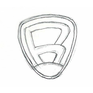
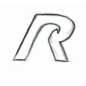
1. SKETCHING
The first step when designing a logo is sketching. It is very important to make your logo effective. This can be done by paper and pencil drawings or you can use different software like illustrator or photoshop.


Image Source - http://www.rosswelborn.com/wp-content/uploads/2012/01/Sketches_Page_1.jpg
2. SCALABLE
It should look good in both small and large sizes. Because size does matter, make sure that logo do not loose their definition when scaled down.
3. COLORS
Colors are extremely important. Don't use more than three colors. Keep it simple, avoid using bright colors. The most important thing is that the logo must look good in black and white. make sure colors evoke feelings and moods.

Image Source- https://lavalisedejosephine.files.wordpress.com/2015/10/cercle-chromatique.jpg
4. SIMPLE & RECOGNIZABLE
Do not make complicated logos with too many elements, It can confuse your client. Simple logos are recognized faster. It should relate to your company name or advantage you offer.


Image Source - https://upload.wikimedia.org/wikipedia/commons/thumb/a/a6/Logo_NIKE.svg/2000px-Logo_NIKE.svg.png
Image Source - https://upload.wikimedia.org/wikipedia/commons/thumb/c/ce/Coca-Cola_logo.svg/2000px-Coca-Cola_logo.svg.png
5. TYPOGRAPHY
Designer oftenly find it difficult to select right font type and size for their new logo. The best way is to search on google and research for font combinations related to your project type. You can choose either serif or sans serif font or may be combination of both using formatting like making text bold, italic and emphasized wherever required is a good practise.
LOGO DESIGN PRINCIPLES
SMART
S - Simple
M - Memorable
A - Appropriate
R - Resizable
T - Timeless
0 Comment(s)